
AI content creation: how to build a true brand personality
Packaging is where a brand meets its audience. It presents the product, expresses the brand’s world and gives people the cues they need to choose it.
Packaging design must therefore bring several elements together: brand visibility, a clear understanding of the offer and differentiation between products. These challenges take different forms depending on whether you are modernizing a range, creating a new brand or preparing a product line for export.
Organize how the product is read
The brand name, the type of product, its variety and its features all need to find their place in a clear composition.
This visual hierarchy guides choices of typography, color, illustration and layout. It gives the range a shared structure while keeping distinctive cues for each product.
A color can identify a flavor. An illustration can suggest a use. A consistent position for the product name can make it easier to read several packs side by side.
Together, these form a graphic system that must work on every product and across the whole range.
Cafés Ben Yedder: evolving a range
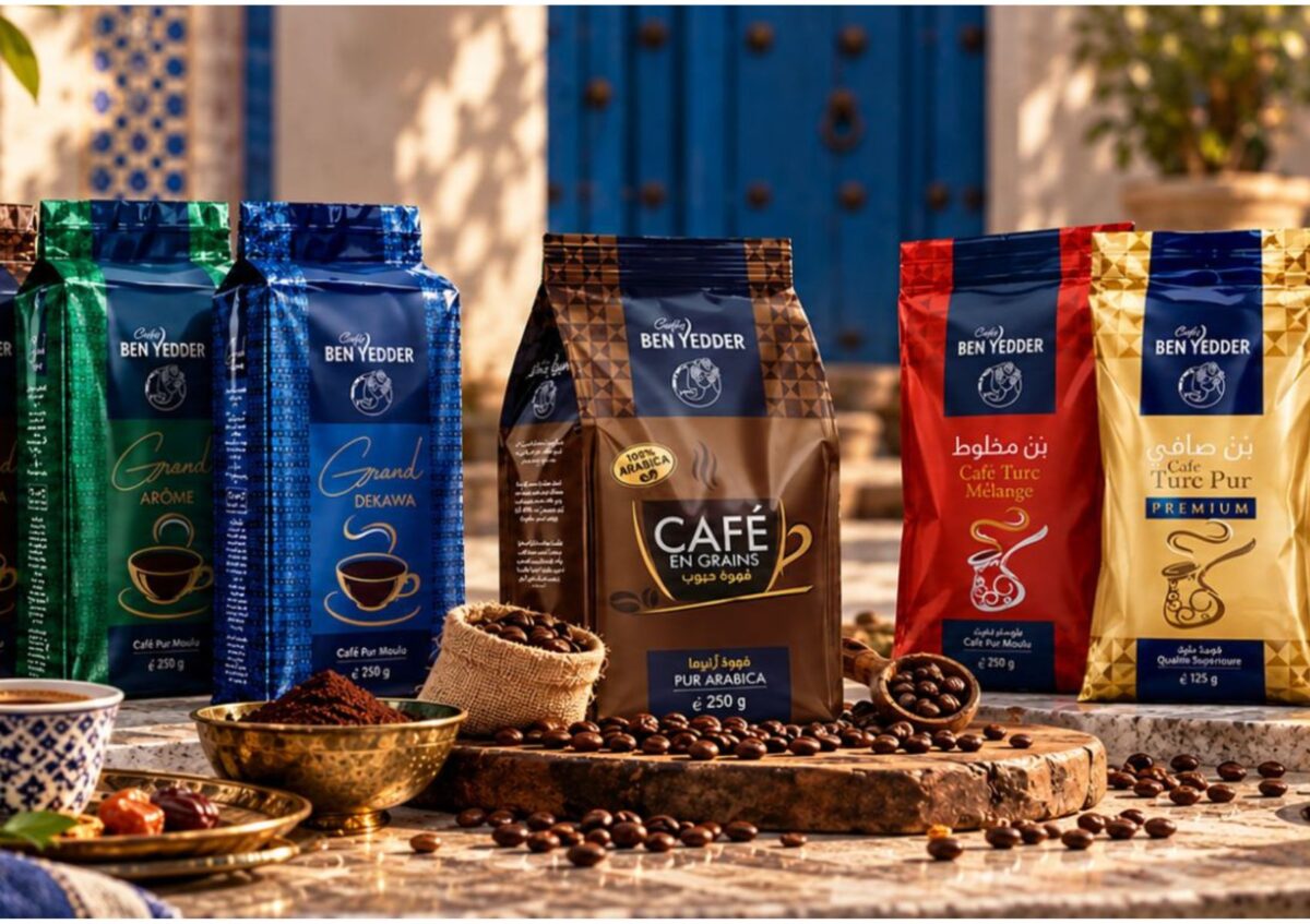
For Cafés Ben Yedder, we redesigned the packaging of several products, from coffee beans to Turkish coffee.
The work focused on the consistency of the whole range and the personality of each product. Color codes, typography and illustrations structure the packs and create landmarks within the offer.
This redesign keeps continuity with the brand’s identity while refreshing its presentation. It shows how design can support the evolution of a range its consumers already know well.
Aneïa: giving an origin a visual expression
When creating a brand, packaging helps build its identity from day one.
For Aneïa, a Tunisian olive oil brand, the heritage of Zaghouan inspired the name, the visual world and the brand story. The packaging expresses these roots through a contemporary, premium presentation.
The bottle thus carries a story tied to the product and its origins. The name, the graphic codes and the storytelling build a single expression, designed to support the brand internationally.

MUST: designing a range for export
For MUST, we designed the packaging for a range of drinks aimed at international markets.
Bright colors, contrasting typography and flavor cues create a dynamic world. The design balances brand visibility, product differentiation and clear information.
An export project benefits from defining its markets, audiences and distribution channels right from the brief. The languages and content to include should also be anticipated to keep the layout readable across the different versions.
Review packaging in real display conditions
A design proposal deserves to be viewed at the pack’s actual size, next to the other products and in the formats used online.
These mock-ups make it possible to check how the name reads, how the products stand apart and how consistent the whole range is. They help fine-tune the design before production.
At DOZE, we support packaging creation and redesign projects in Tunisia, from the graphic concept to range extensions.
Let’s give your products an identity people recognize and an offer they understand.